REF: SYS_ACTIVE // PRELOAD_V14
ARRAY: INSTANT_INITIALIZATION
STATUS: CALIBRATED
Expert Emergency Response Training Tailored to You

Occupational Safety Consultants

Background

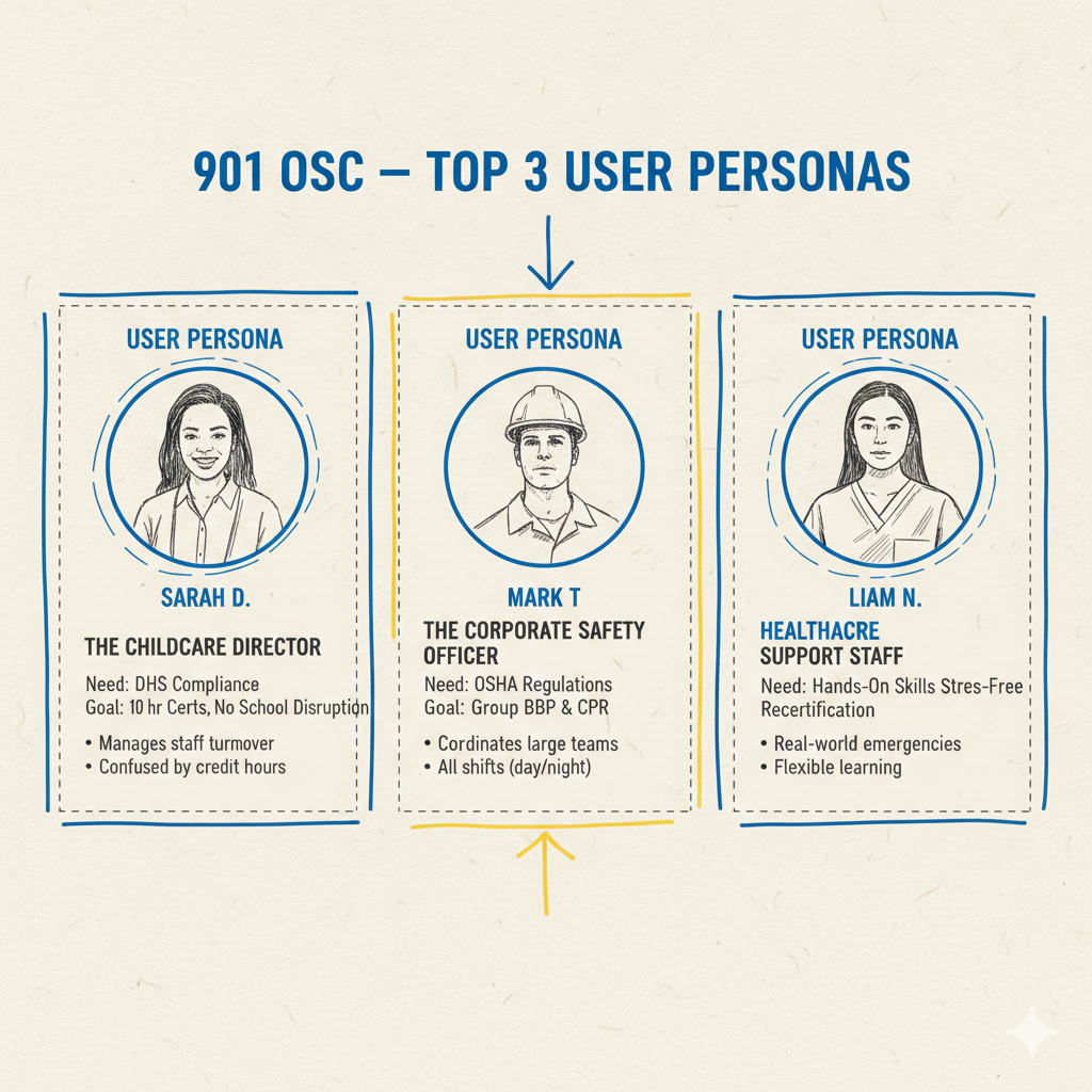
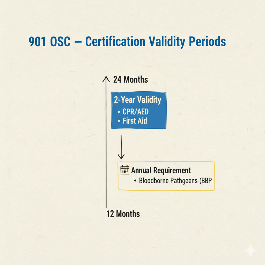
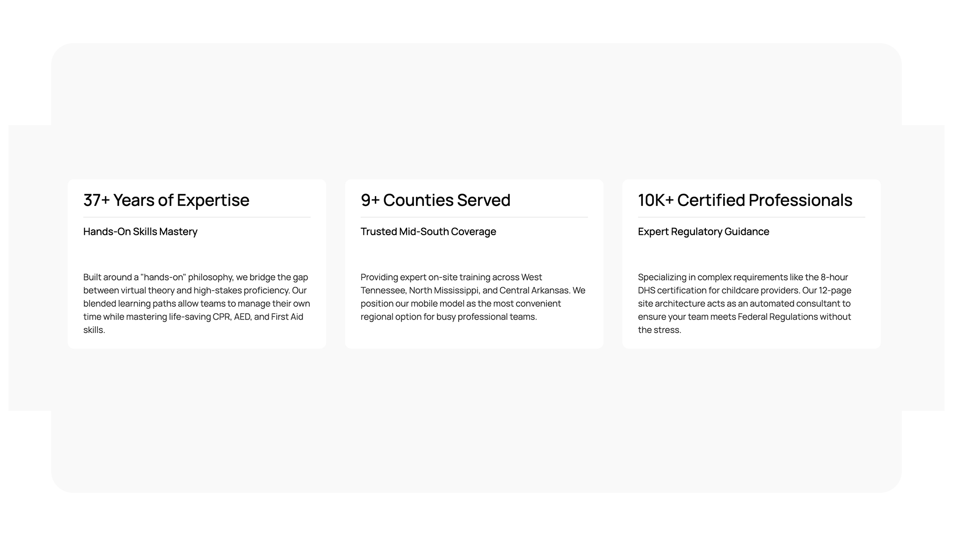
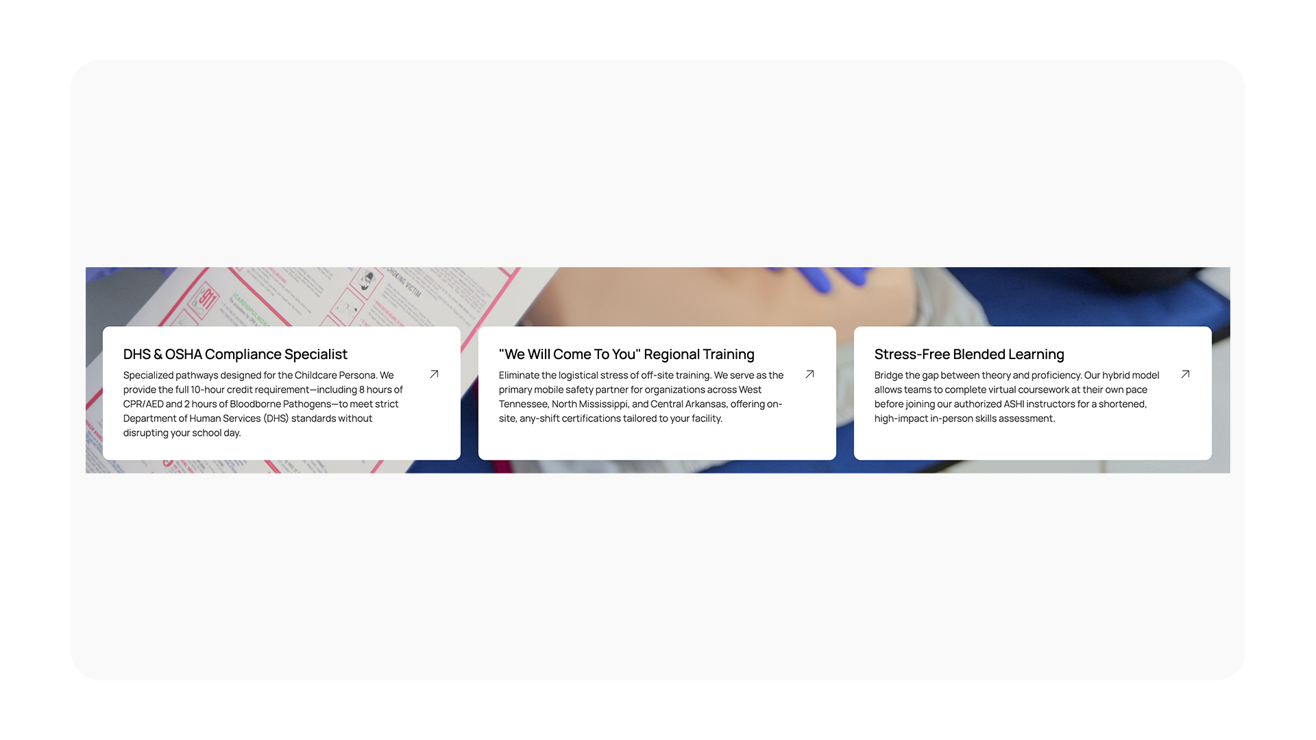
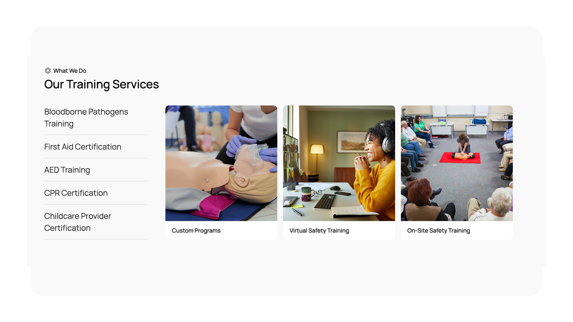
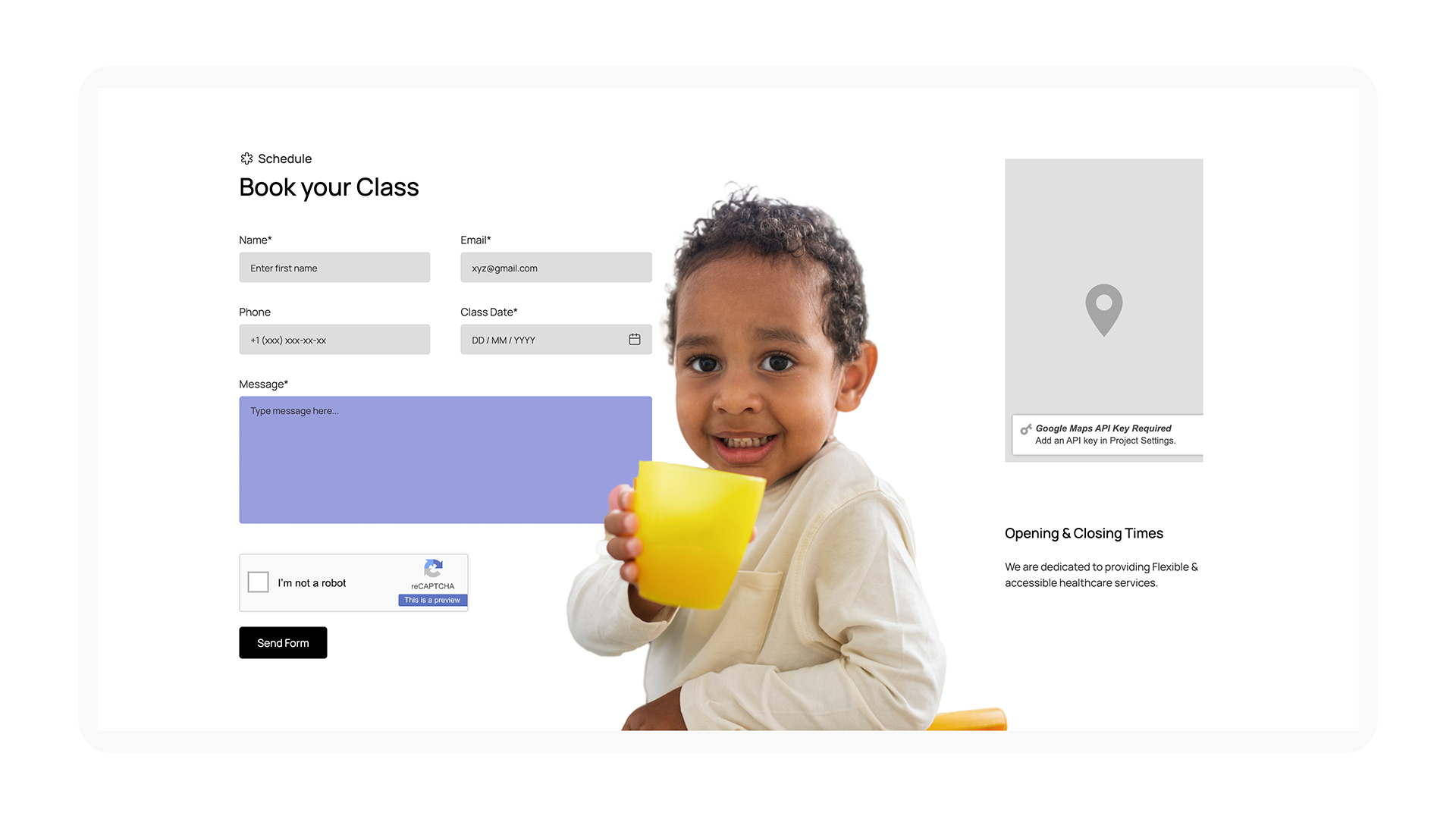
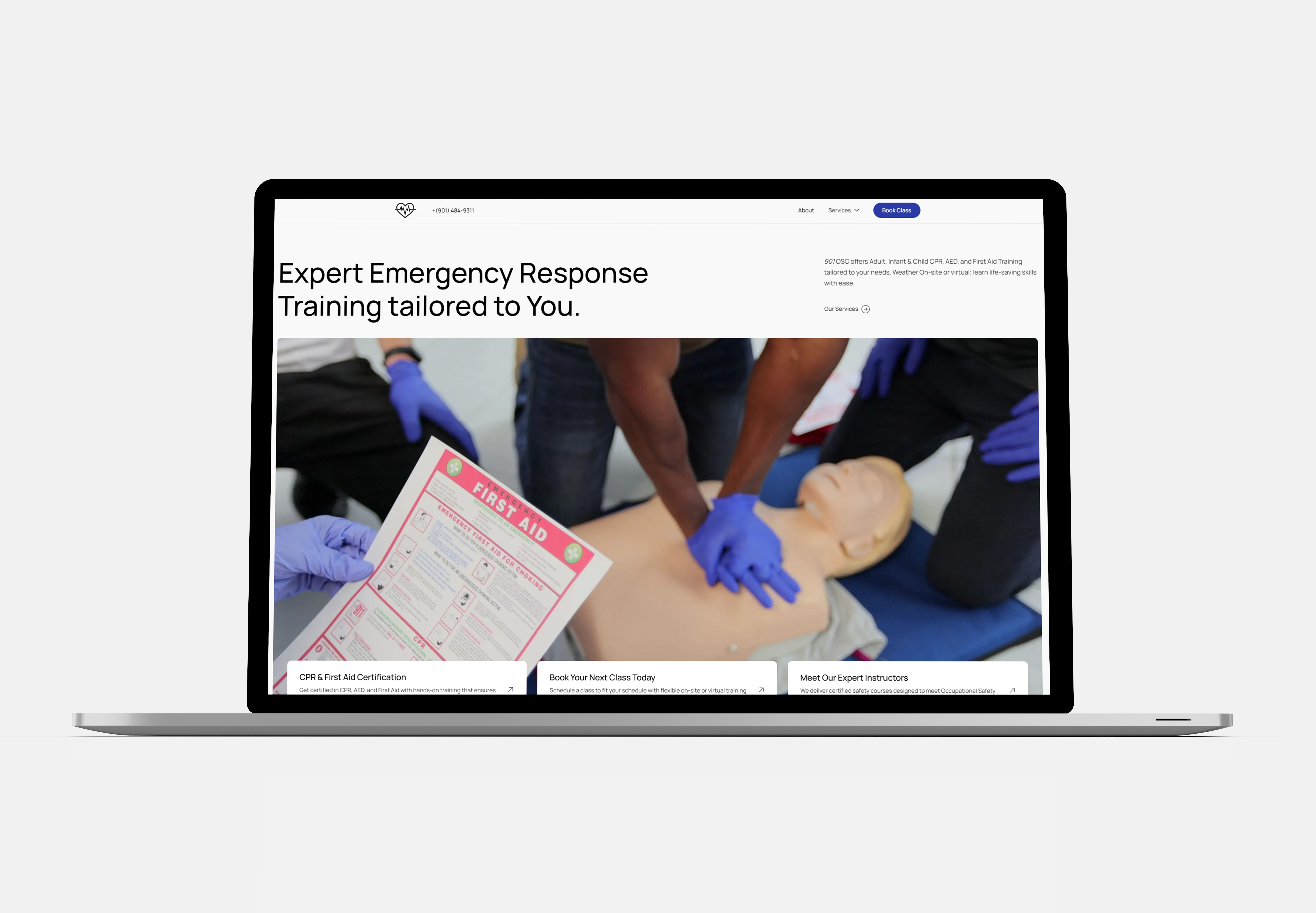
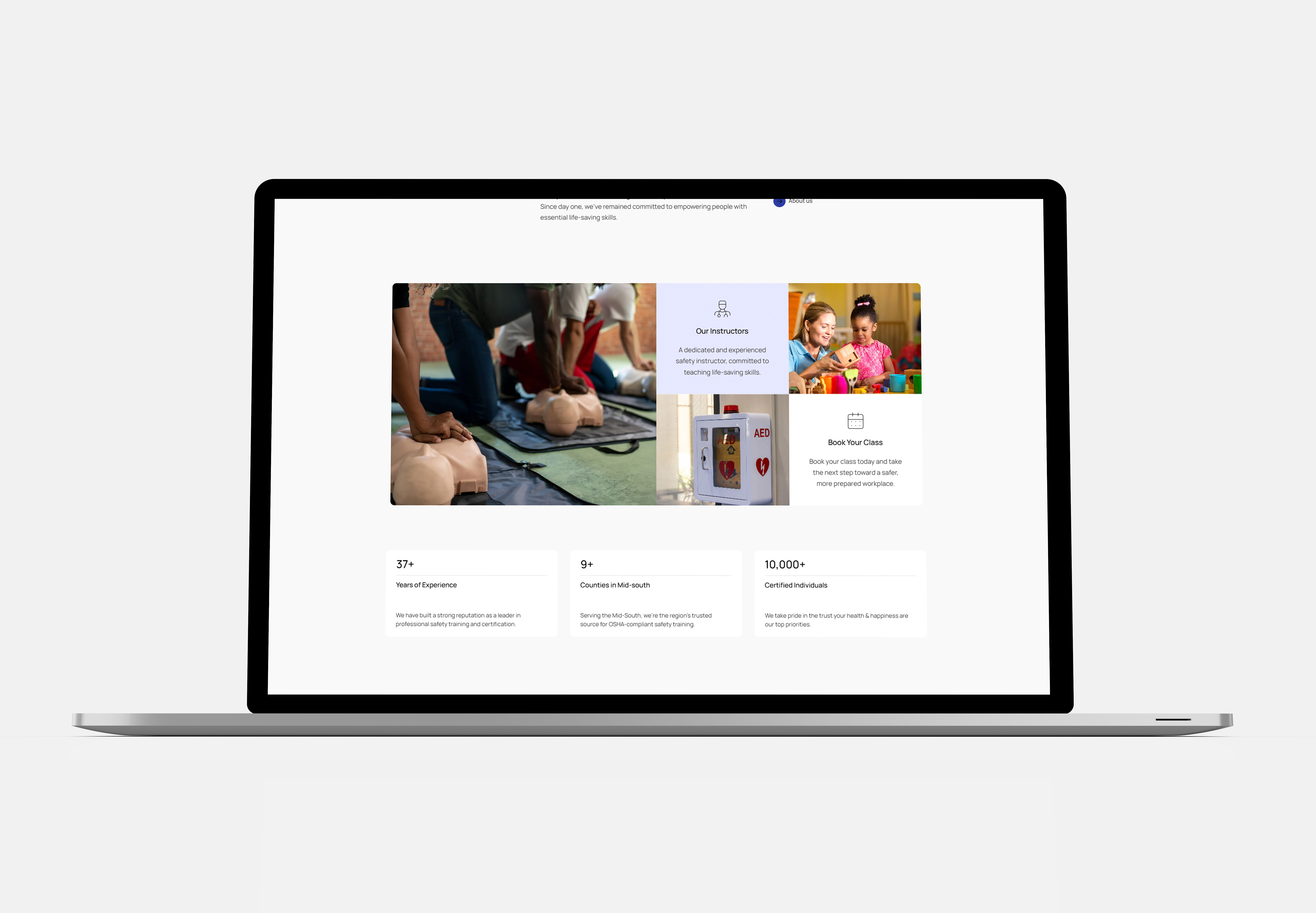
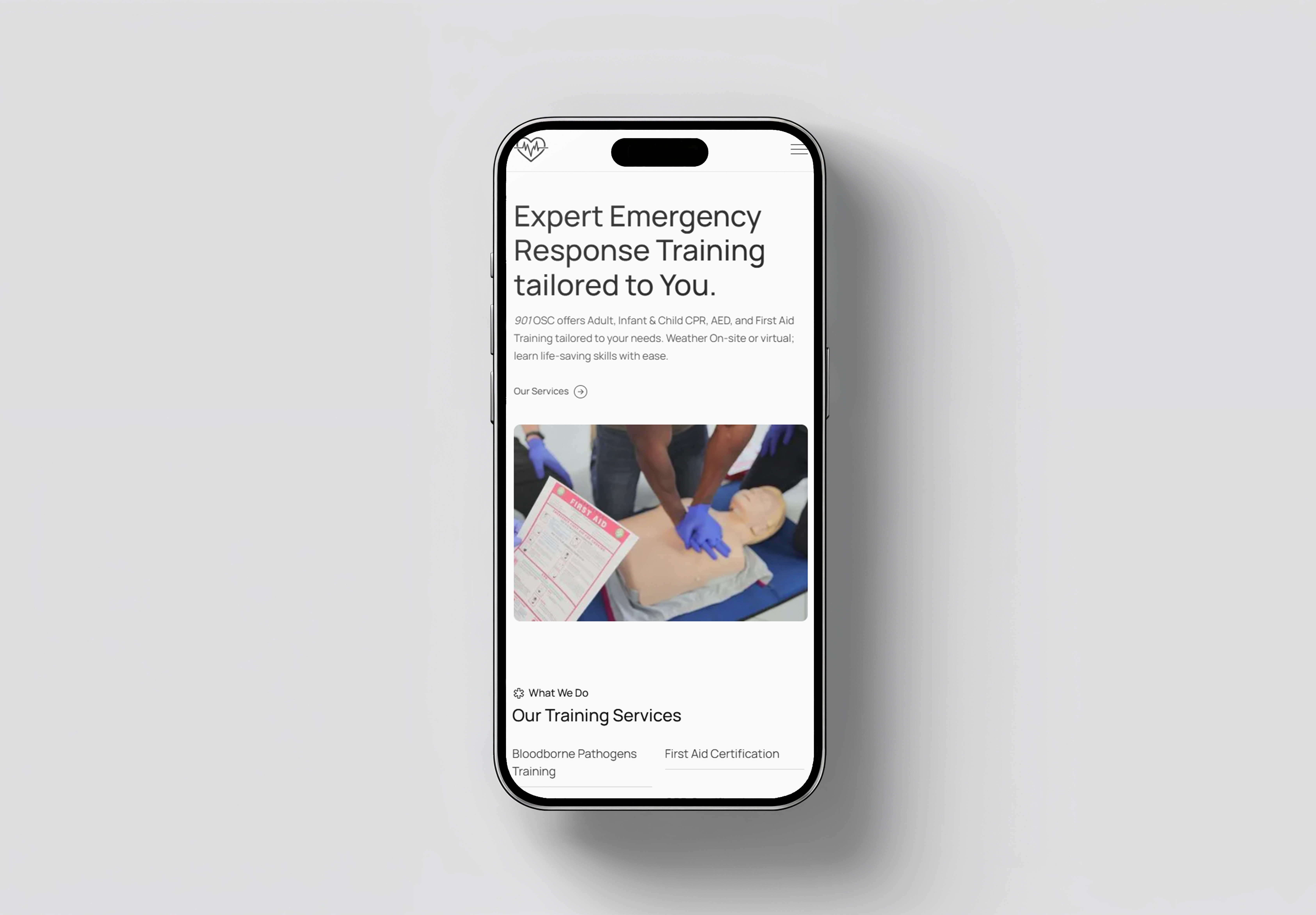
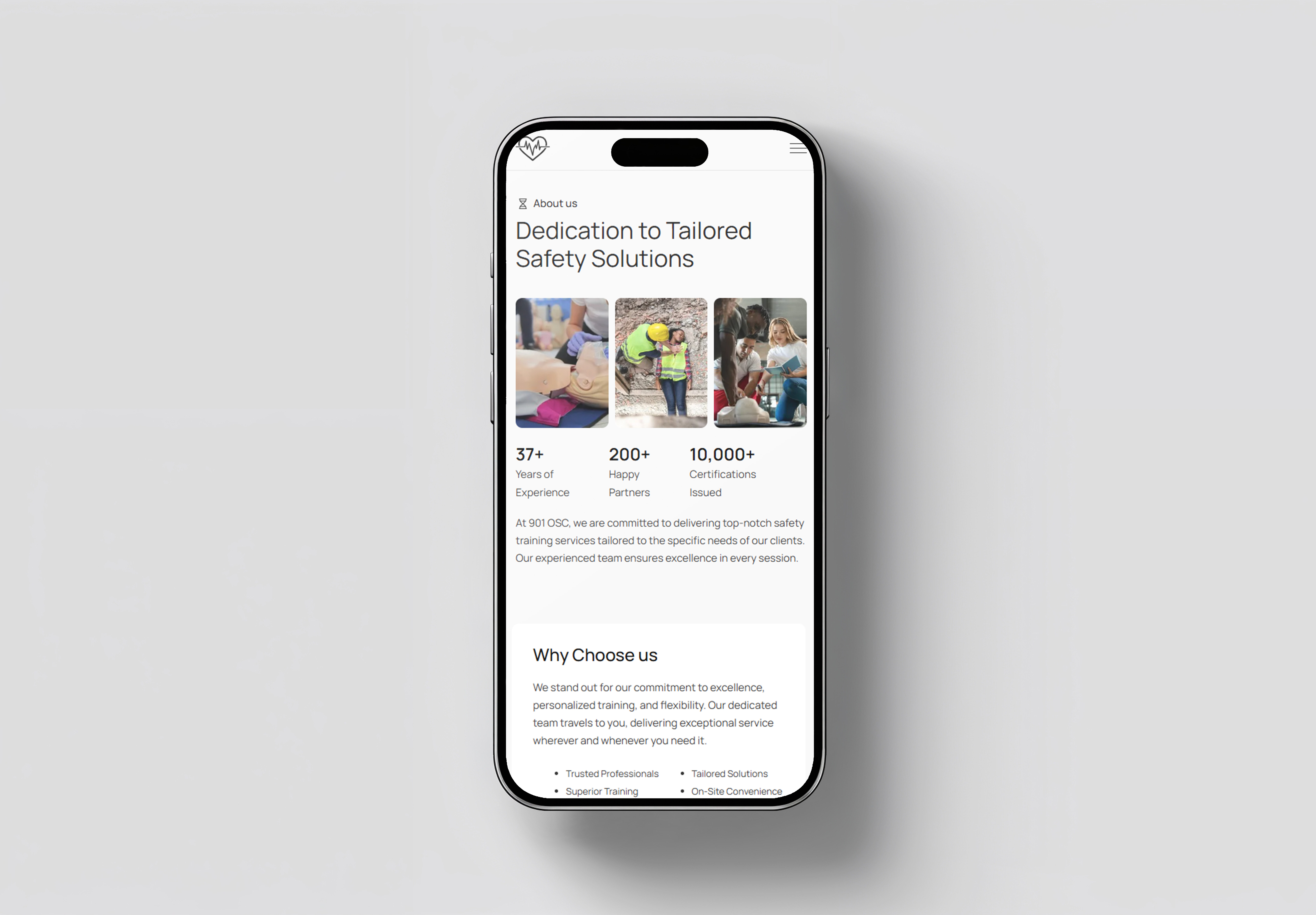
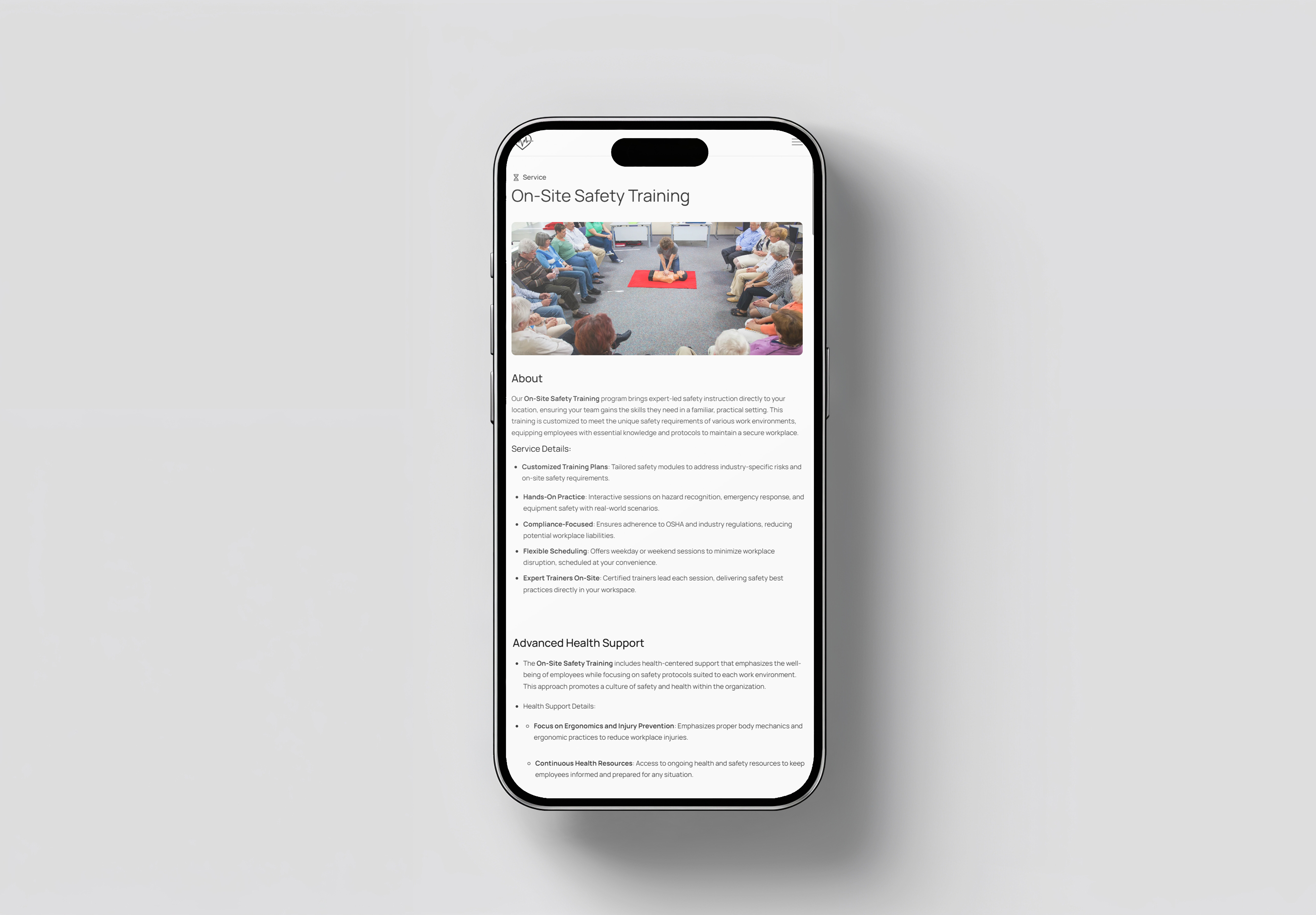
901 Occupational Safety Consultants (901 OSC) is a Veteran-owned American Safety & Health Institute (ASHI) Training Site that has operated since 1996. Based in Cordova, Tennessee, they provide essential certifications in CPR, AED, First Aid, and Bloodborne Pathogens to a diverse clientele, including teachers, healthcare staff, and corporate safety teams.
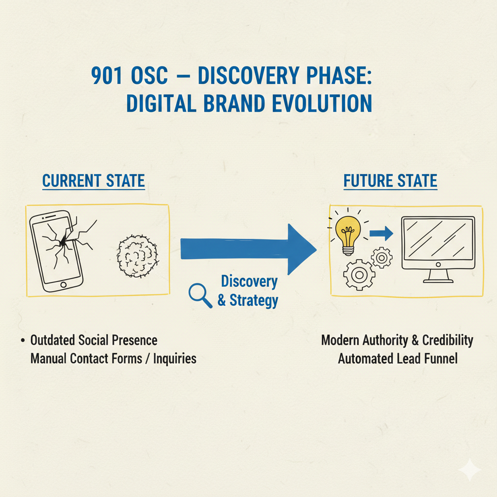
Challenges

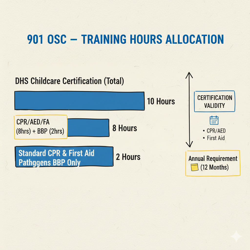
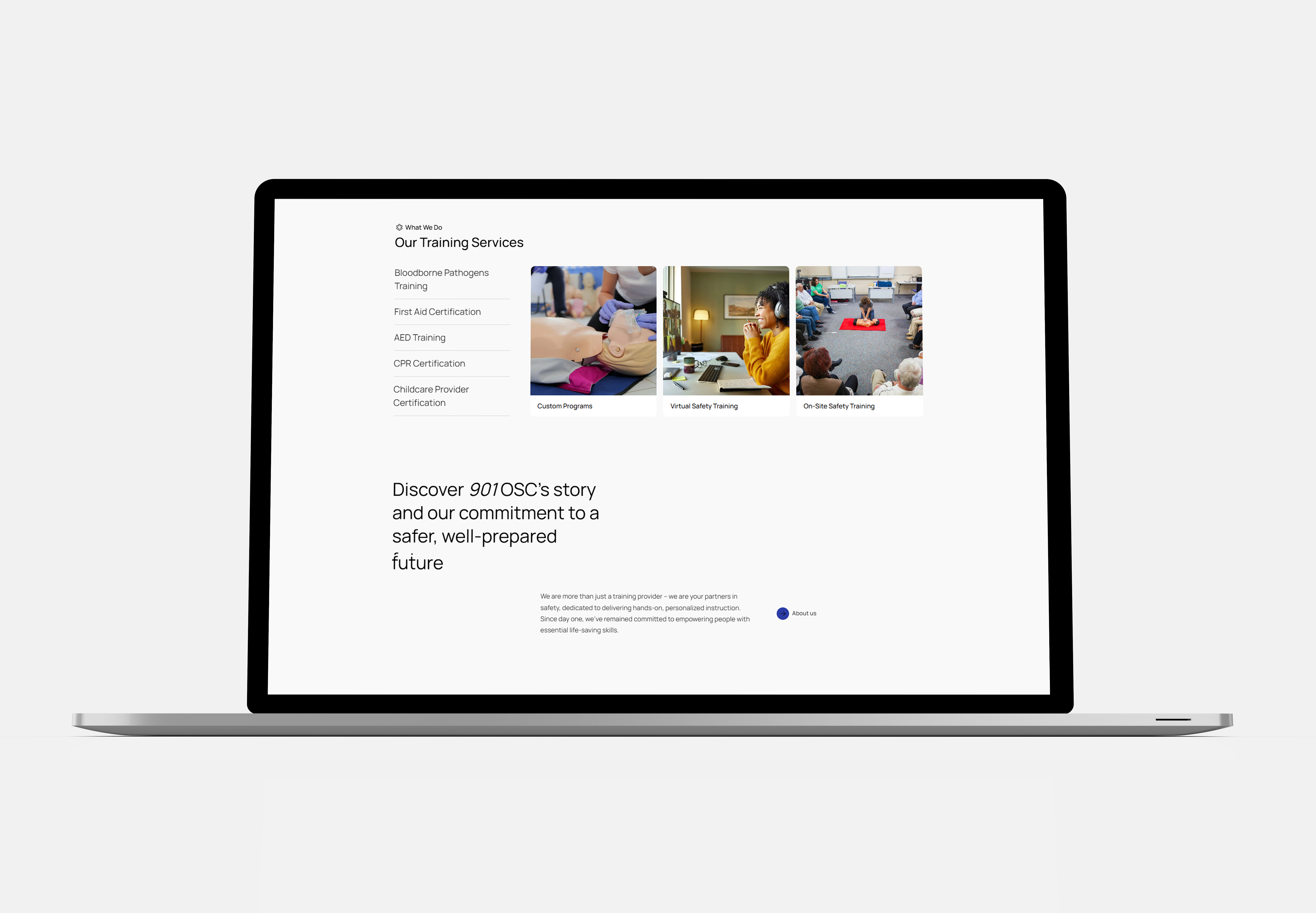
Despite nearly three decades of expertise, the primary challenge was streamlining a complex array of certification requirements into a "stress-free" user experience. The brand needed to communicate its vast service area—covering West Tennessee, North Mississippi, and Eastern/Central Arkansas—while highlighting its unique "We Will Come To You" mobile training model.

Date

February 2026

Goal

To design a user-centric digital gateway that simplifies complex safety compliance, scales the reach of 901 OSC’s mobile training services, and streamlines the path to life-saving certification.

Client

Occupational Safety Consultants

Role

Lead Visual Experience Strategist

Tools

Figma, Adobe Creative Suite, Miro

The Discovery

Business Goals
What is the core business objectives?
The primary goal was to modernize the enrollment funnel to capture new leads for on-site corporate and childcare training across West TN, North MS, and AR.
#1
Certification Barriers
WHERE IS THE SERVICE GAP?
There was a gap in providing flexible training models that allowed personnel to start coursework remotely while still meeting hands-on proficiency requirements
#2
User Friction
What is the biggest Pain point?
Potential clients were overwhelmed by the manual process of verifying DHS vs. OSHA credit hours and coordinating in-person sessions for large groups.
#3

Approach & Strategy

Prioritize Accessible Training
The core of the digital strategy was making 901 OSC’s mobile nature a primary call-to-action. By emphasizing that training is available throughout West Tennessee, North Mississippi, and Eastern/Central Arkansas, the site positions the business as the most convenient regional option.
#1
Simplify Complex Compliance
The 12-page site map was designed to act as an automated consultant. It directly addresses the specific needs of childcare providers—such as the 8-hour DHS certification requirement—to ensure they find exactly what they need without manual inquiry.
#2
Design for Skill Proficiency
The visual hierarchy was built around the company’s "hands-on" philosophy. By organizing classes into clear categories (CPR, First Aid, BBP), the design ensures users understand the scope of the 2-year and annual certification cycles.
#3
Build a Flexible Learning Path
The integration of the virtual option serves as a modern bridge for busy teams. This hybrid approach ensures that the "stress-free" promise is met by allowing users to manage their own time while still achieving the high-stakes proficiency required by Federal Regulations.
#4

The Result

A Lead-Driven Professional Hub

By prioritizing 901 OSC’s mobile "We Will Come To You" philosophy, the homepage acts as a regional concierge for safety training across Tennessee, Mississippi, and Arkansas.

Integrated Virtual Training Gateway

This feature addresses the modern need for flexibility, allowing personnel to learn at their own pace and minimizing the disruption to their work shifts.

Trust Through Specialized Compliance

he solution organizes technical training—such as Opioid Emergency response and OSHA Bloodborne Pathogen standards—into digestible modules that prove 901 OSC’s deep industry knowledge

Automated Enrollment & Booking:

The 12-page architecture was built to scale, providing a seamless user journey from the first click to the final hands-on skills check.

Typography
Colors
Logomark
Font Selection

Manrope

Heading Selection

Occupational Safety

Subheading Selection

Occupational Safety

Paragraph Selection

To rebuild TriQuest's credibility, I developed a new visual identity centered on professionalism and trust. The system features a clean color palette, modern typography, and a consistent set of reusable components to ensure a cohesive and intuitive user experience across the entire site.

Color Palette
primary
#2b3ba5
Secondary
#999fdc
Dark
#202020
Netural
#333
white smoke
#f5f5f5
White
#ffffff
Logo