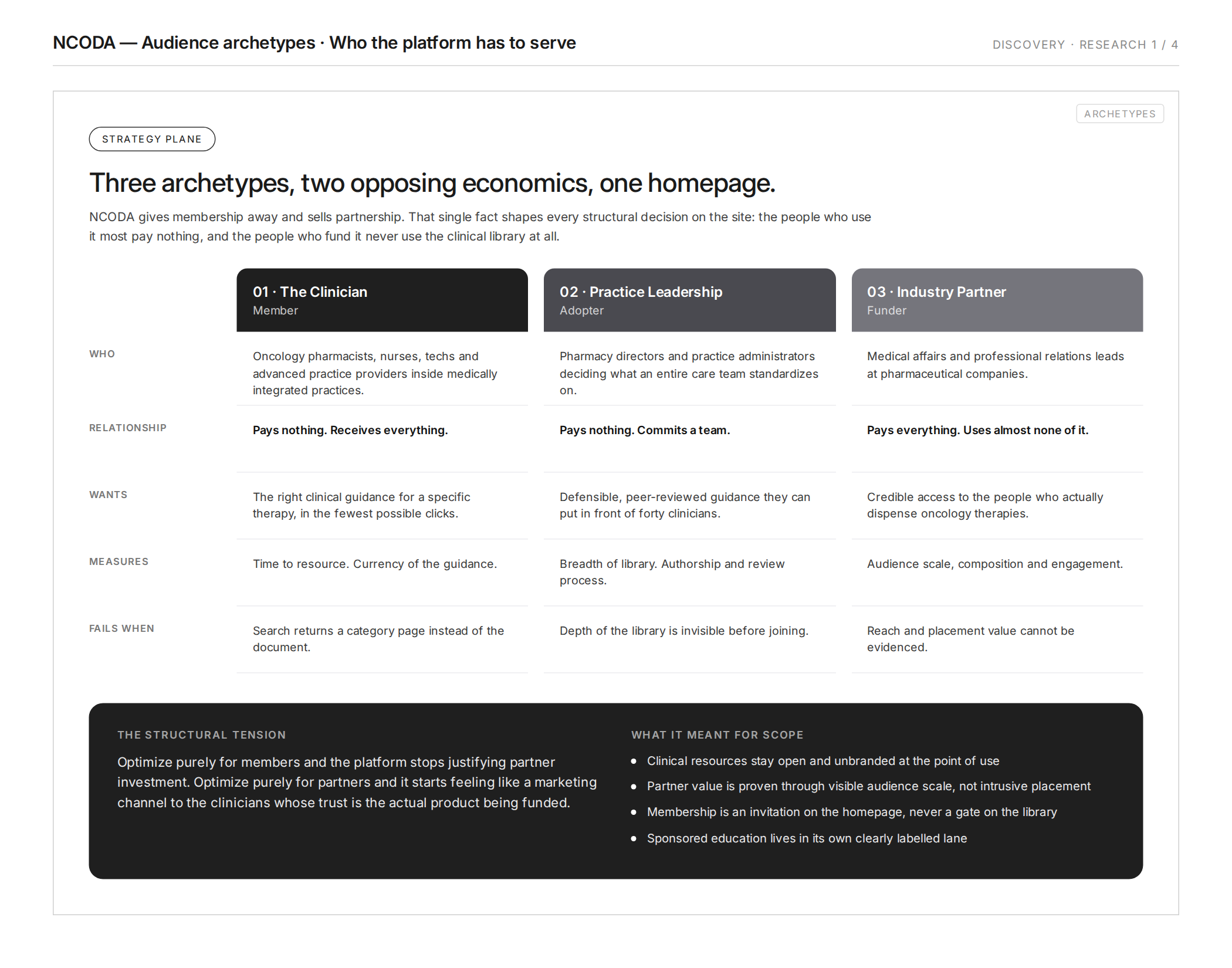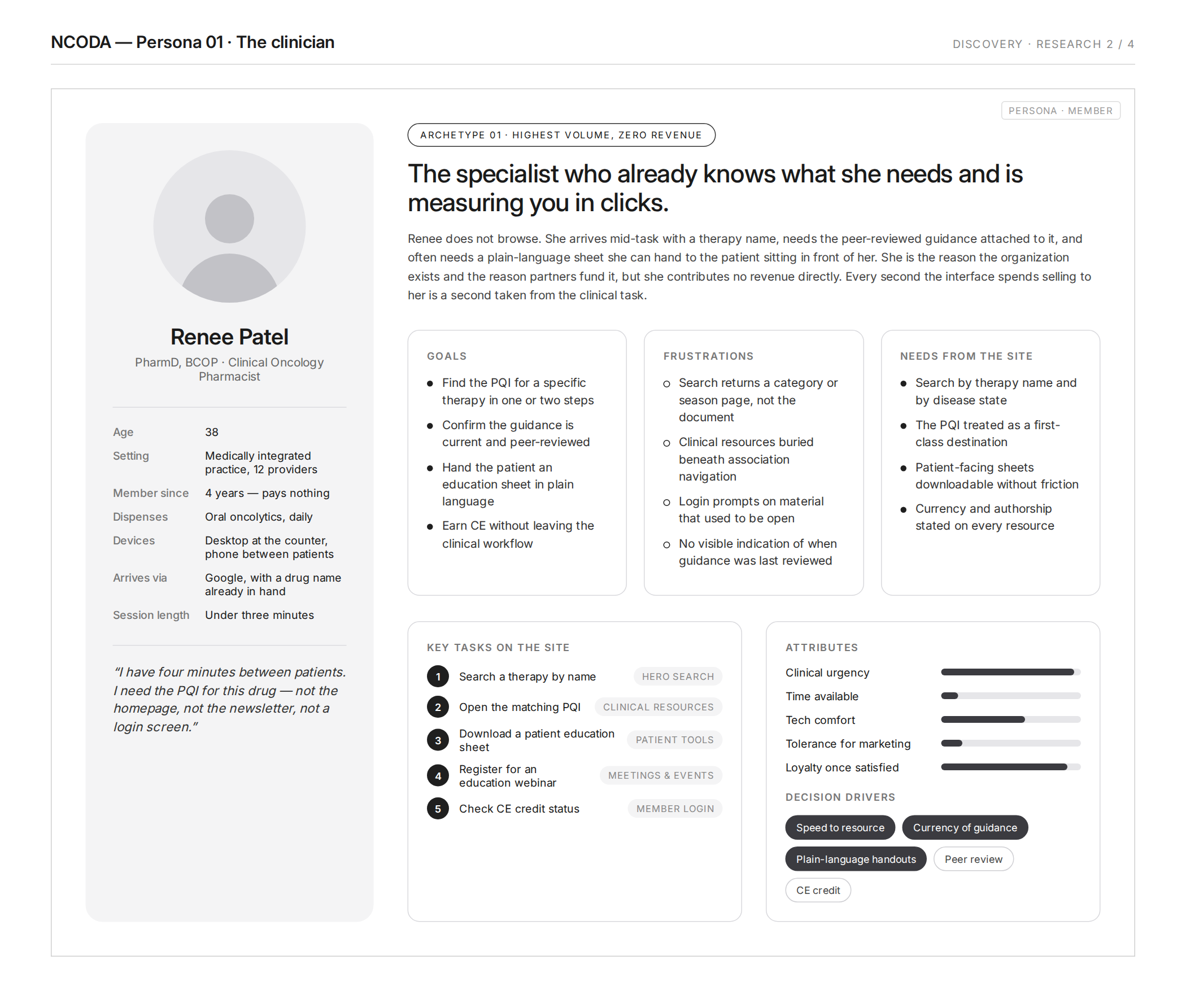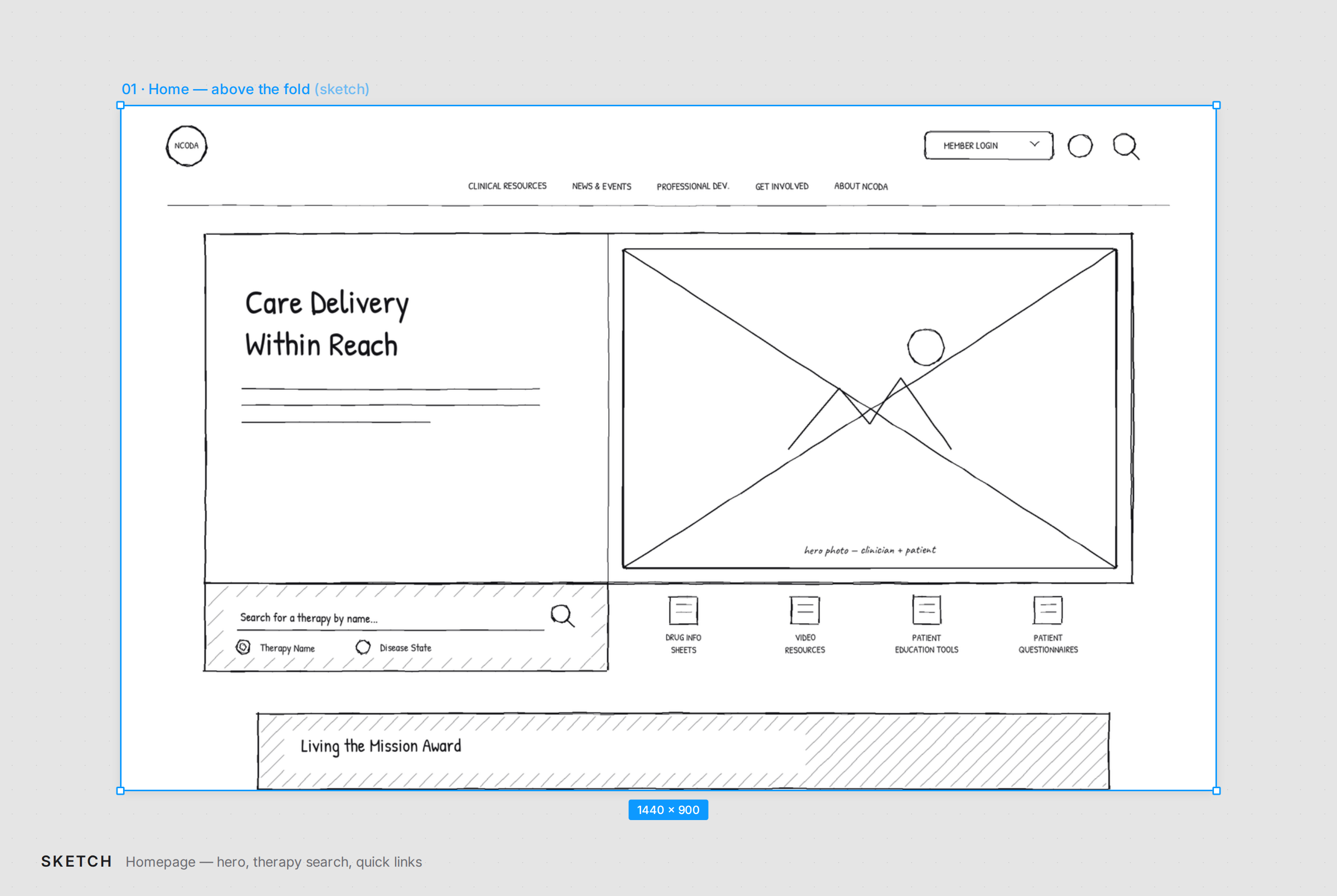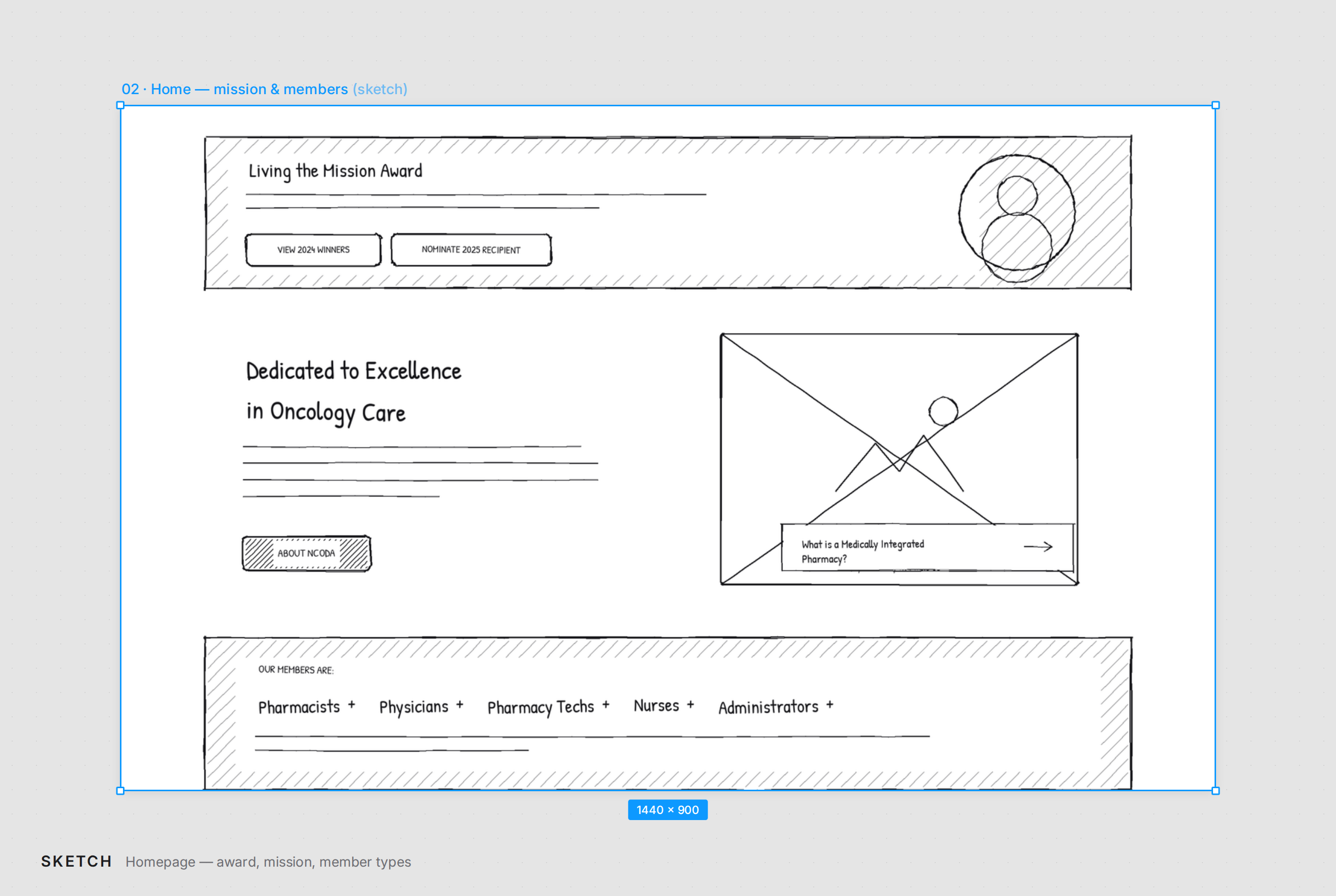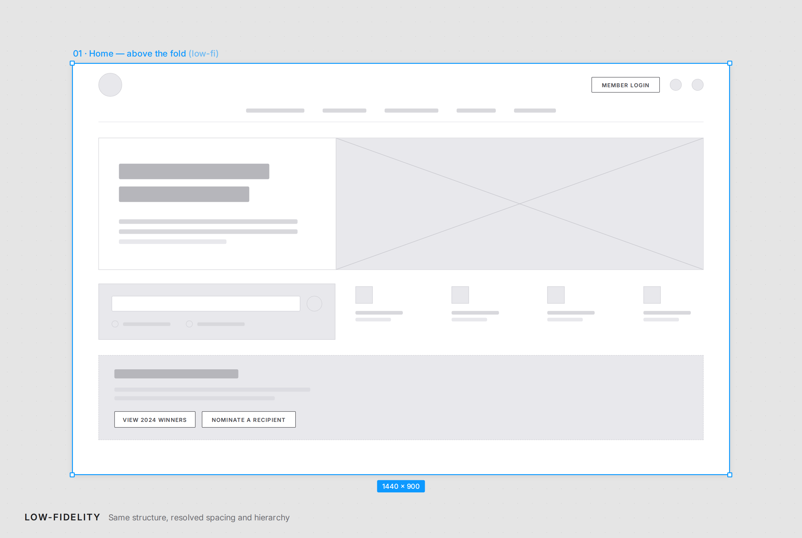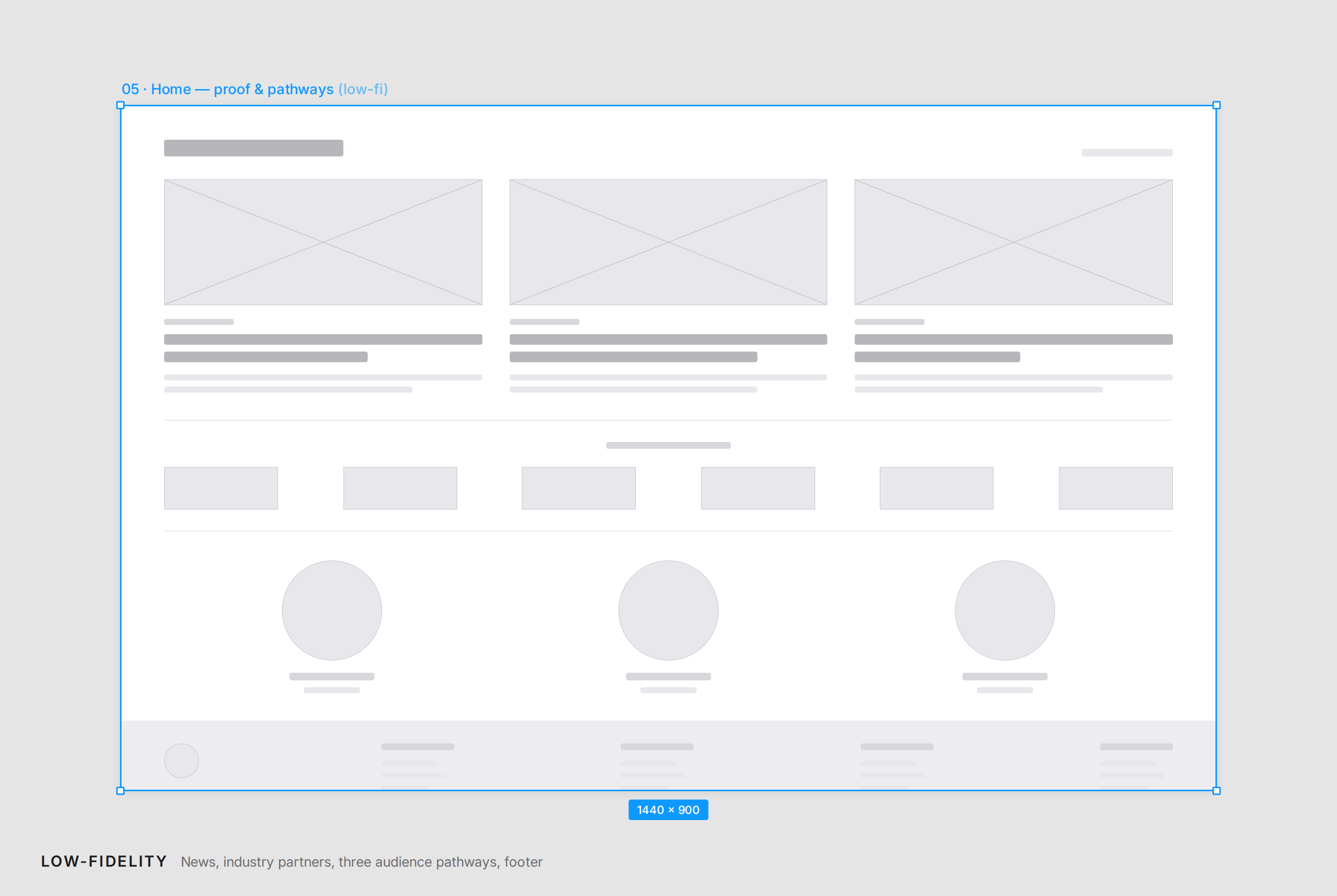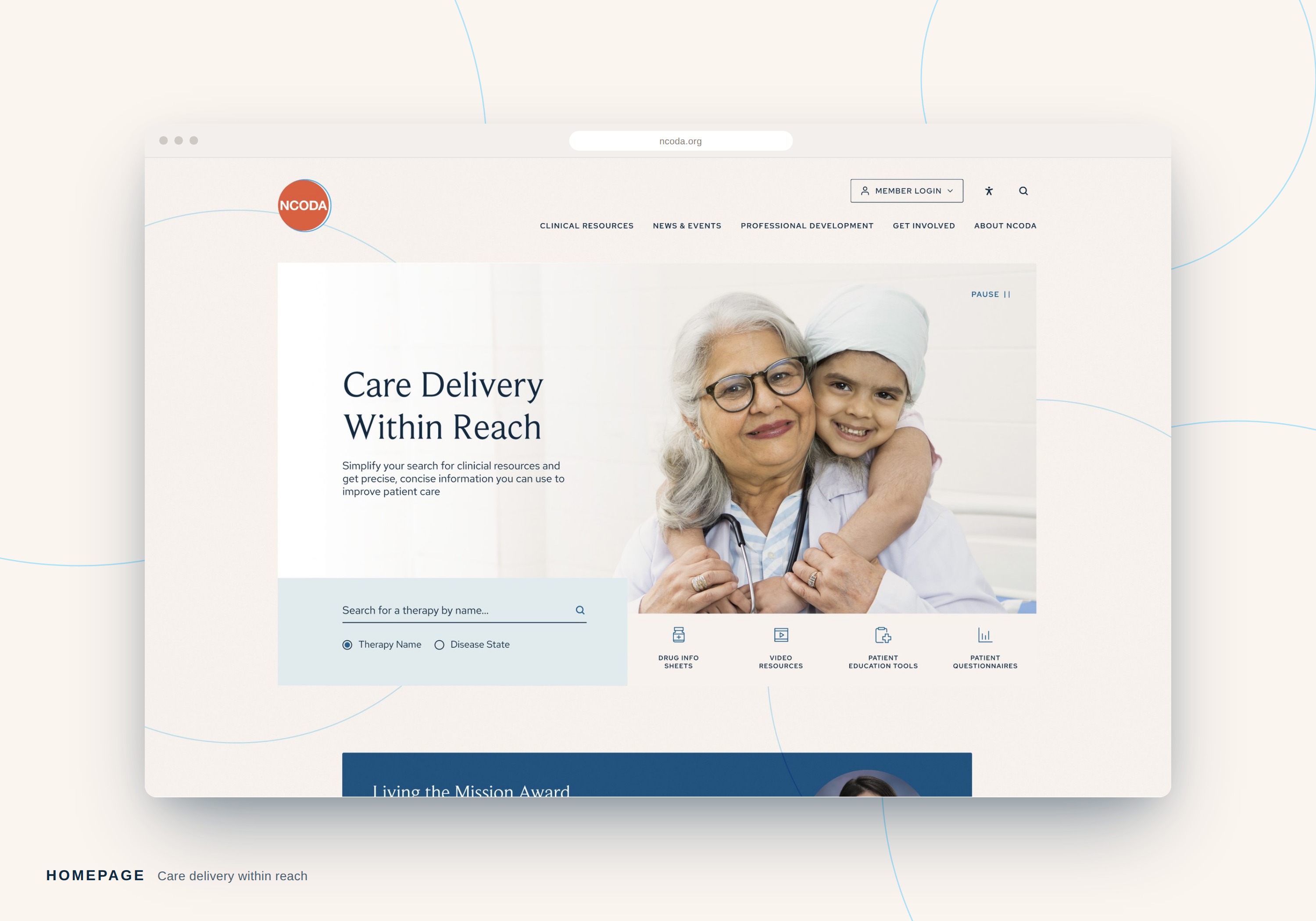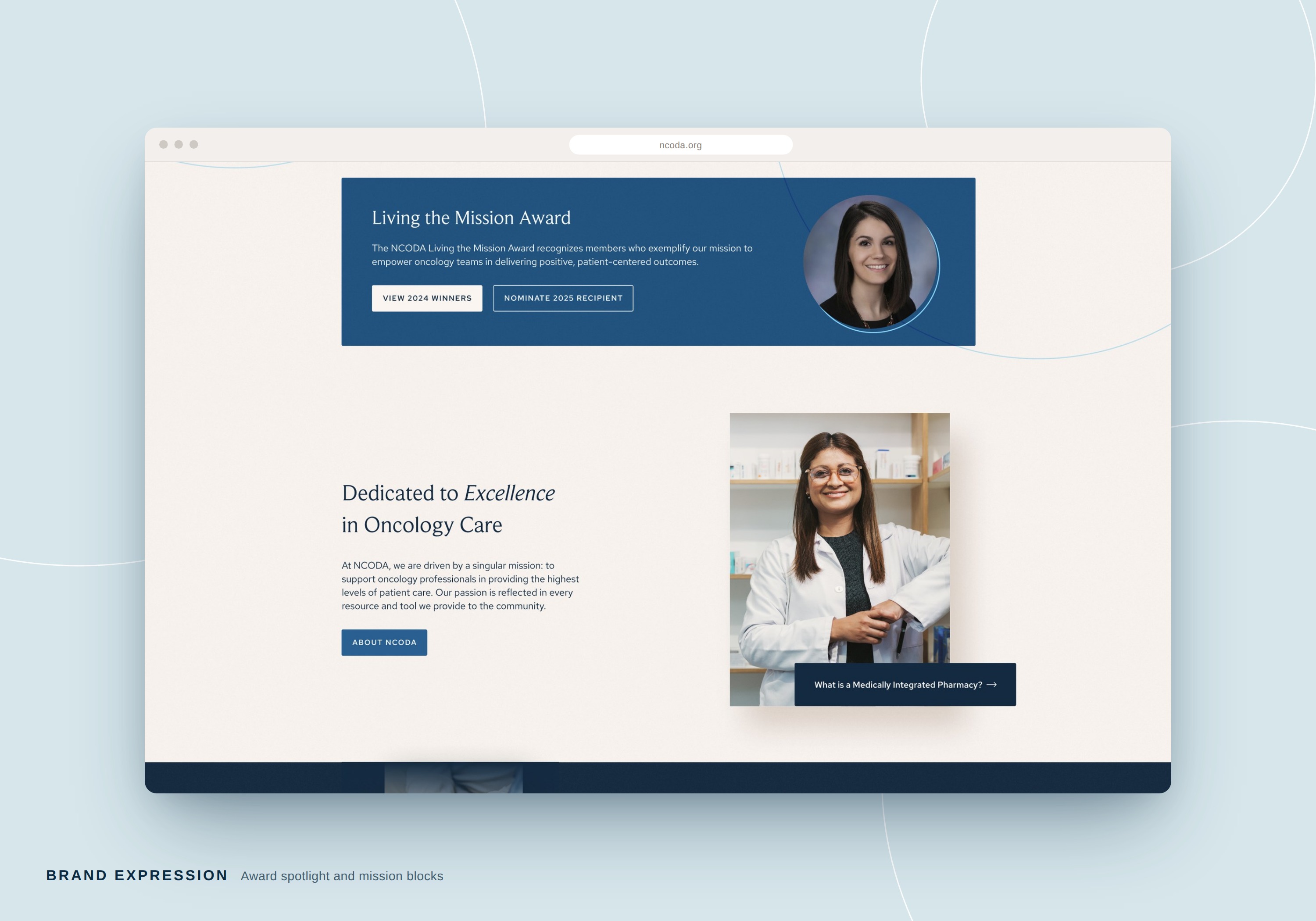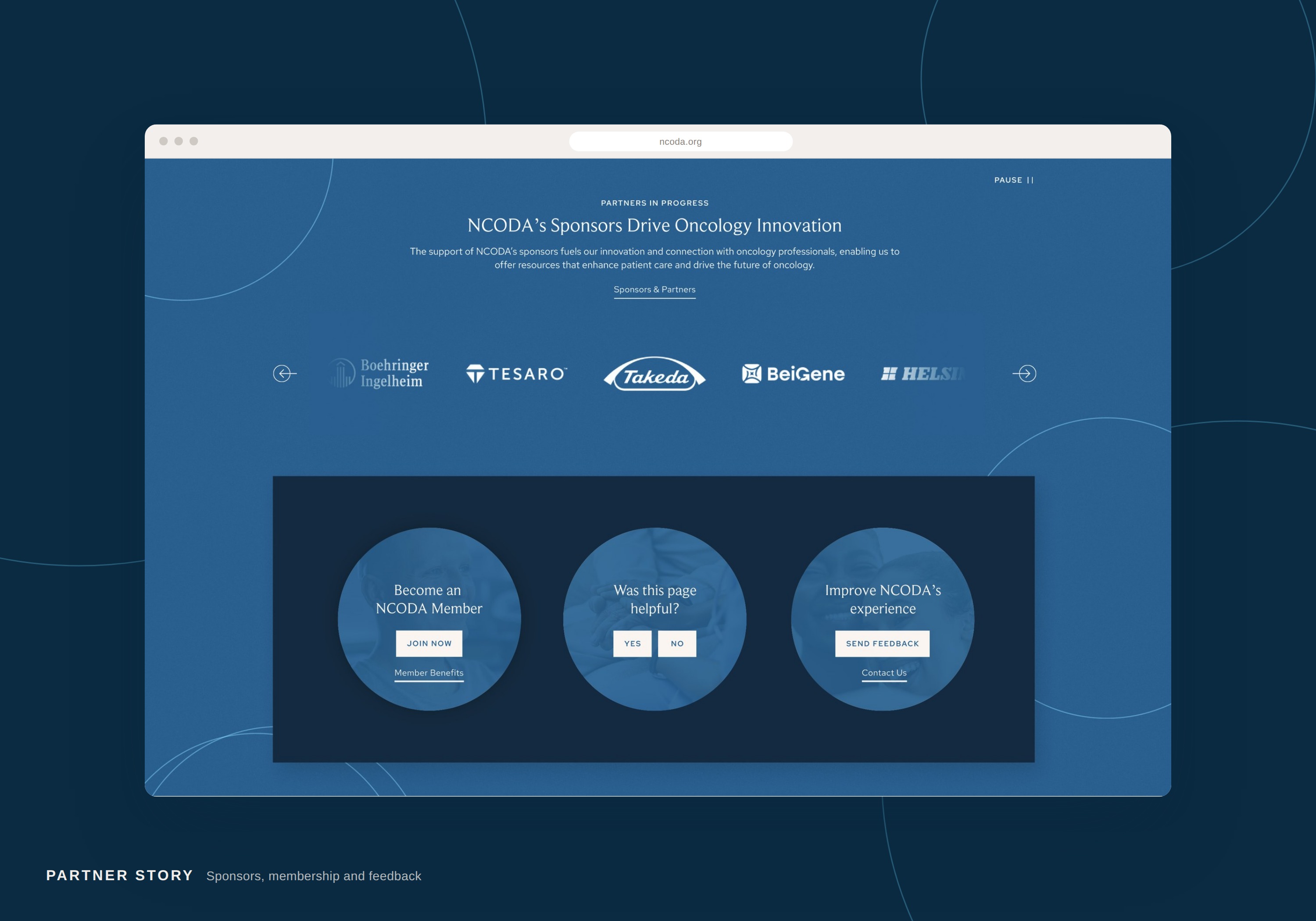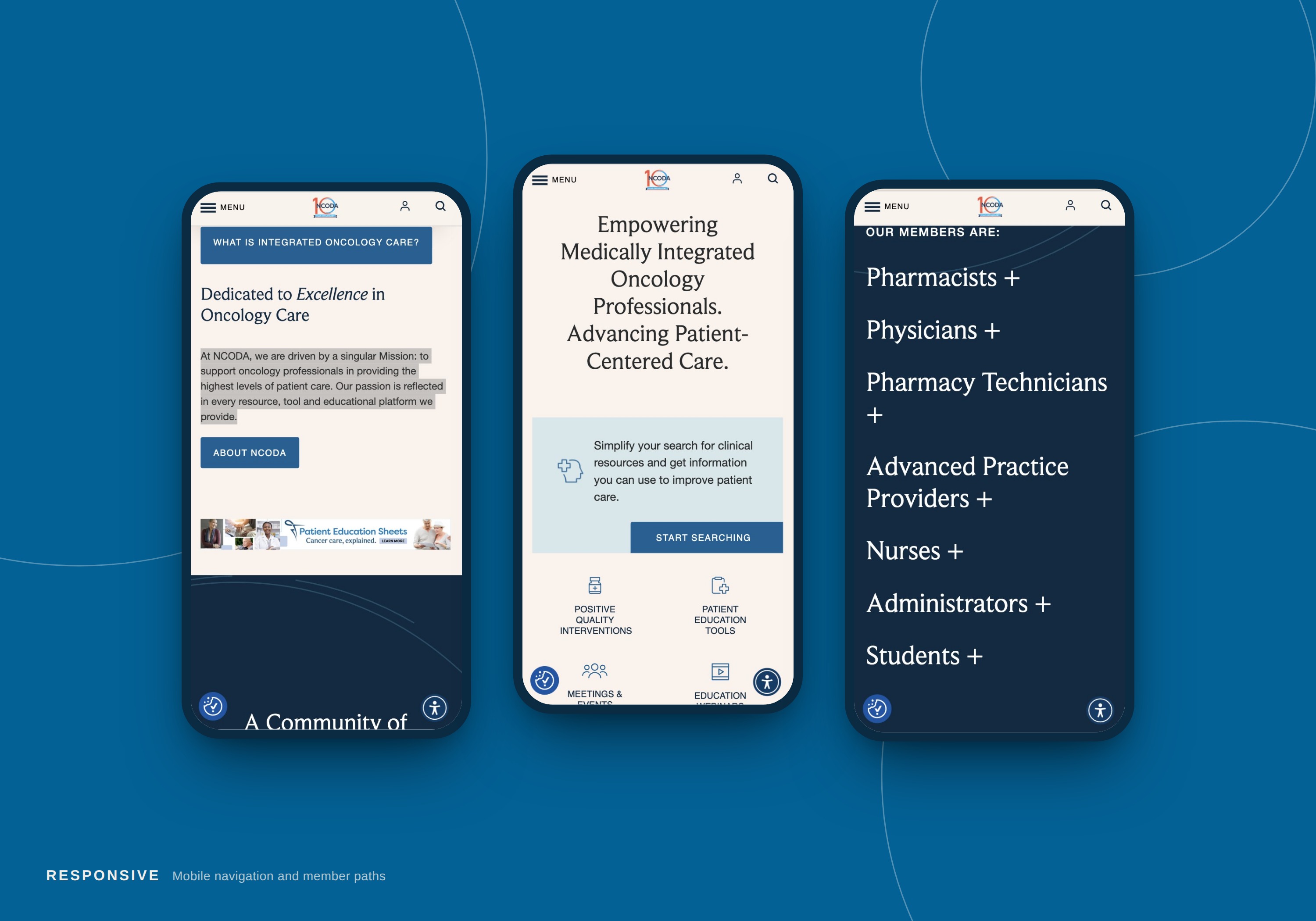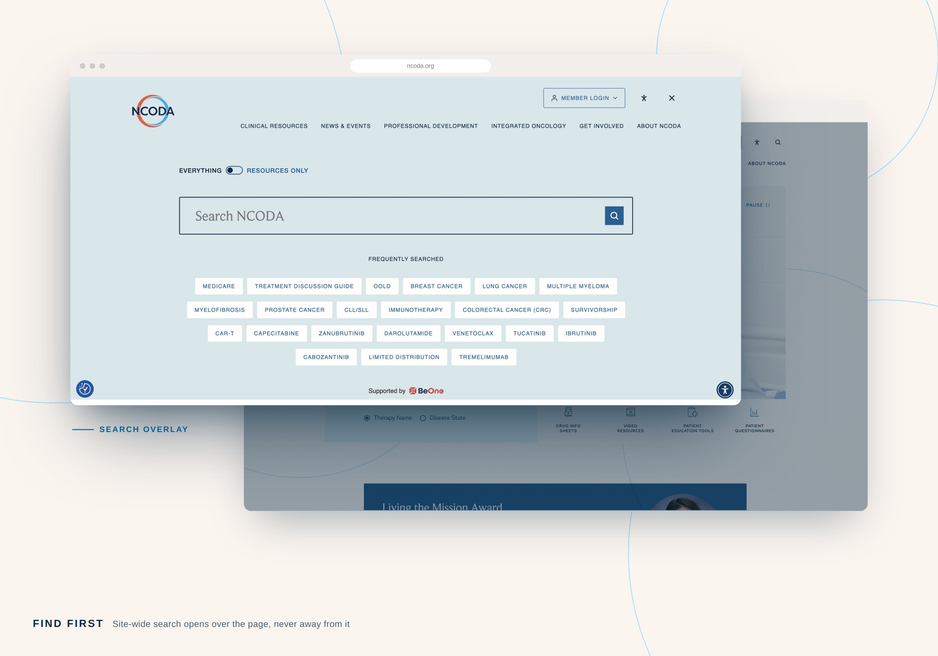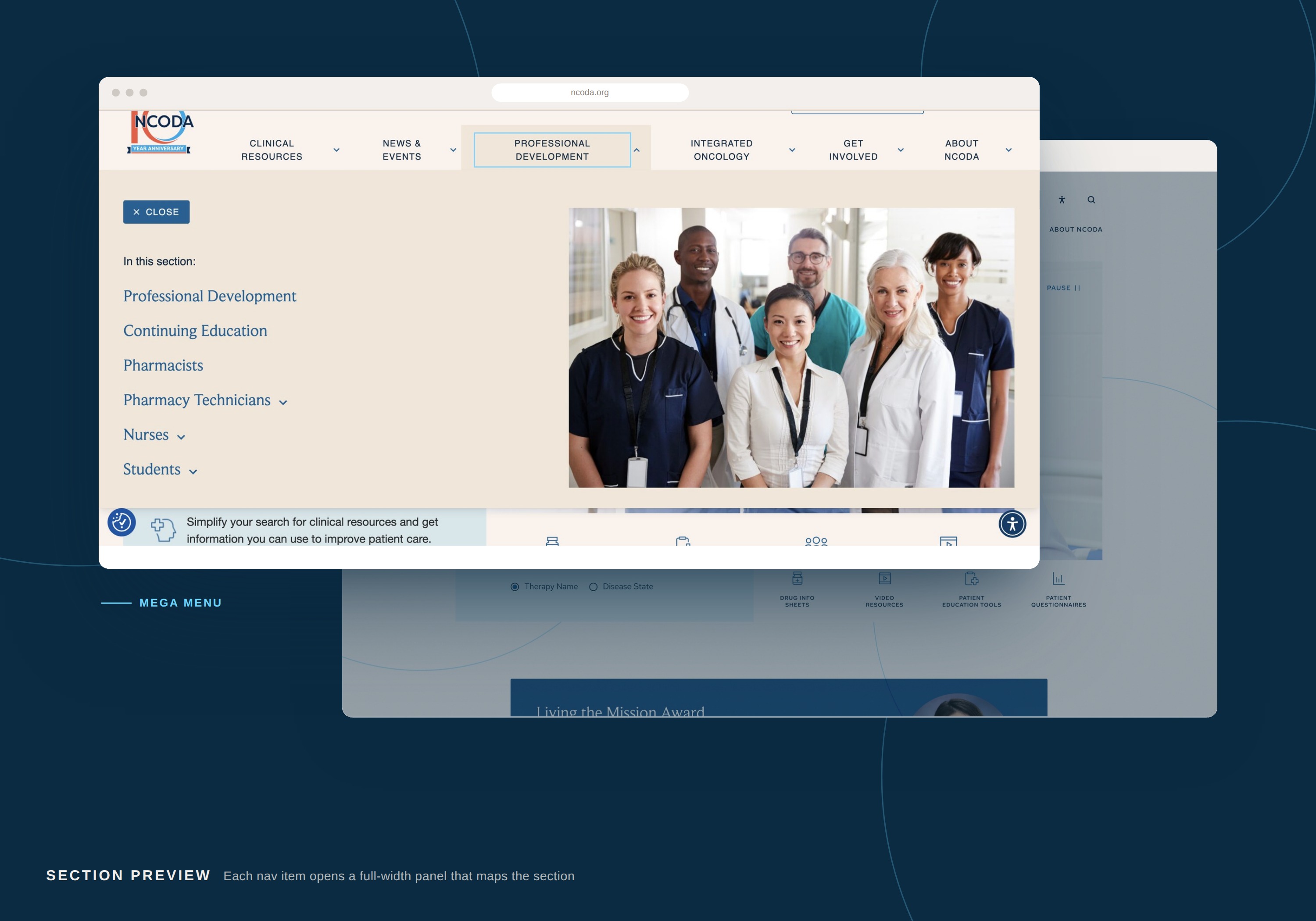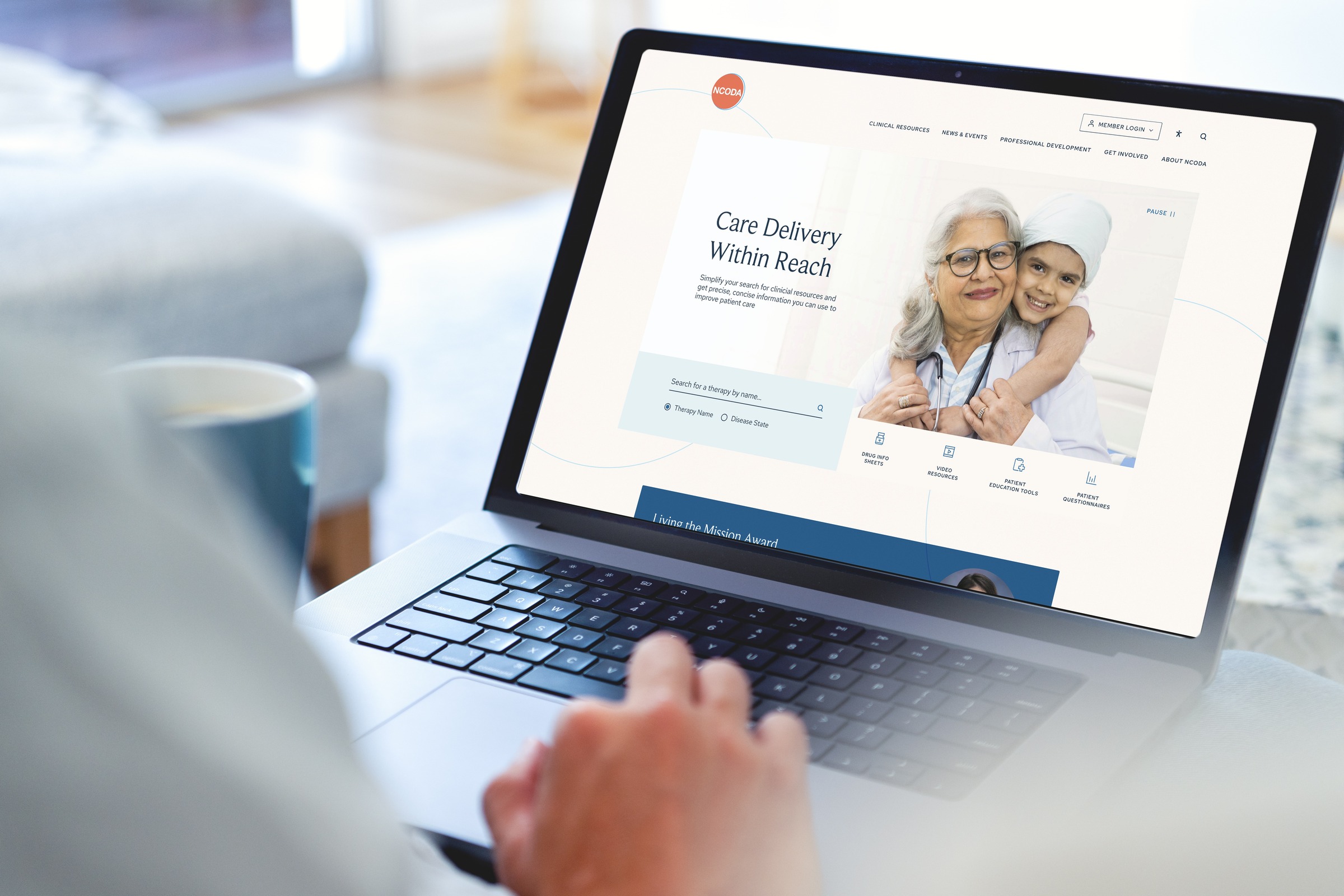
The core challenge was designing for two audiences whose relationship to the organization is structurally opposed. Members receive everything for free and judge the site on how quickly they can reach clinical guidance. Partners fund the organization and judge it on visibility, reach, and the credibility of the audience they are paying to reach. One homepage had to serve both without making either feel like the secondary concern.
Beneath that sat three further constraints: years of bespoke functionality that had to survive a platform migration, a resource taxonomy that had stopped scaling with the library it organized, and a brand refresh running in parallel with the redesign rather than ahead of it.